Nearly all shoppers visit a product detail page before making a purchase, yet 98% of them will abandon that purchase if the product information feels incomplete. The gap between a page that informs and a page that converts is where revenue lives. This guide breaks down exactly how to build product detail pages that close the sale.
Key Takeaways
A product detail page PDP is the most decision-critical page in e commerce, where shoppers decide to buy or leave.
Strong product detail page design focuses on clear product details, rich media, and a frictionless path to the add to cart button.
Transparent pricing, shipping details, and returns information on the detail page directly increase sales and reduce returns.
Mobile-first PDP design and accessibility are now non-negotiable for modern product pages.
Ongoing A/B testing of PDP elements (images, copy, CTAs) is essential for long-term conversion rate growth.
What Is a Product Detail Page (PDP)?
A product detail page is a dedicated URL focusing on one specific product and all its offers. It provides comprehensive product information by combining product data (name, price, specs), media (images, video), and UX elements (variant selectors, add to cart) into a single decision hub.
Each product detail page should correspond to a unique product. Variations like size selection or color are handled as options on the same page rather than spawning separate URLs. Marketplaces like Amazon take this further by using one shared product detail page per product, with multiple sellers adding their own offers and pricing.
You will see PDPs referred to by several names: "product page," "product details page," "detail page," and "product detail page PDP" all describe the same thing.
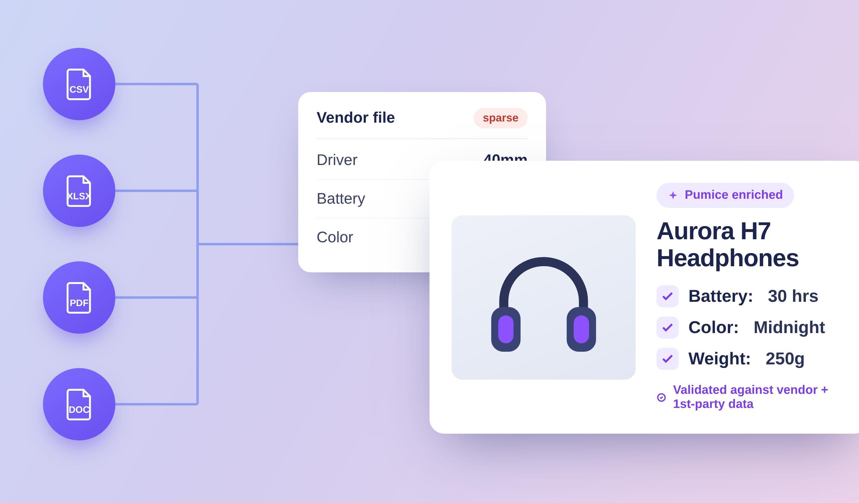
PDPs are built from a number of data sources
Why Product Detail Pages Matter So Much in E‑Commerce
The PDP is the "moment of truth" - the point where buyer intent either converts into a purchase or dissolves into abandonment. Most visitors land directly on product detail pages from Google Shopping, organic search, email, or paid ads, bypassing the homepage and category page entirely. About one in four online shopping sessions begin on a PDP, and those visitors are 72% more likely to bounce than users who enter through other pages.
PDPs are critical for conversion in e commerce. High-quality PDPs can increase customer trust and brand integrity, while complete and accurate product details reduce uncertainty, lower return rates, and cut down on customer complaints. Detailed product descriptions that address specific details - materials, dimensions, compatibility - preemptively answer the questions that cause hesitation.
From an SEO perspective, a well-designed PDP can improve search engine rankings. Unique product content, structured data, and internal links help product pages rank and attract free traffic from search engines. Strong PDP design lets you increase sales without spending more on ads.
Key Components of a High‑Converting Product Detail Page
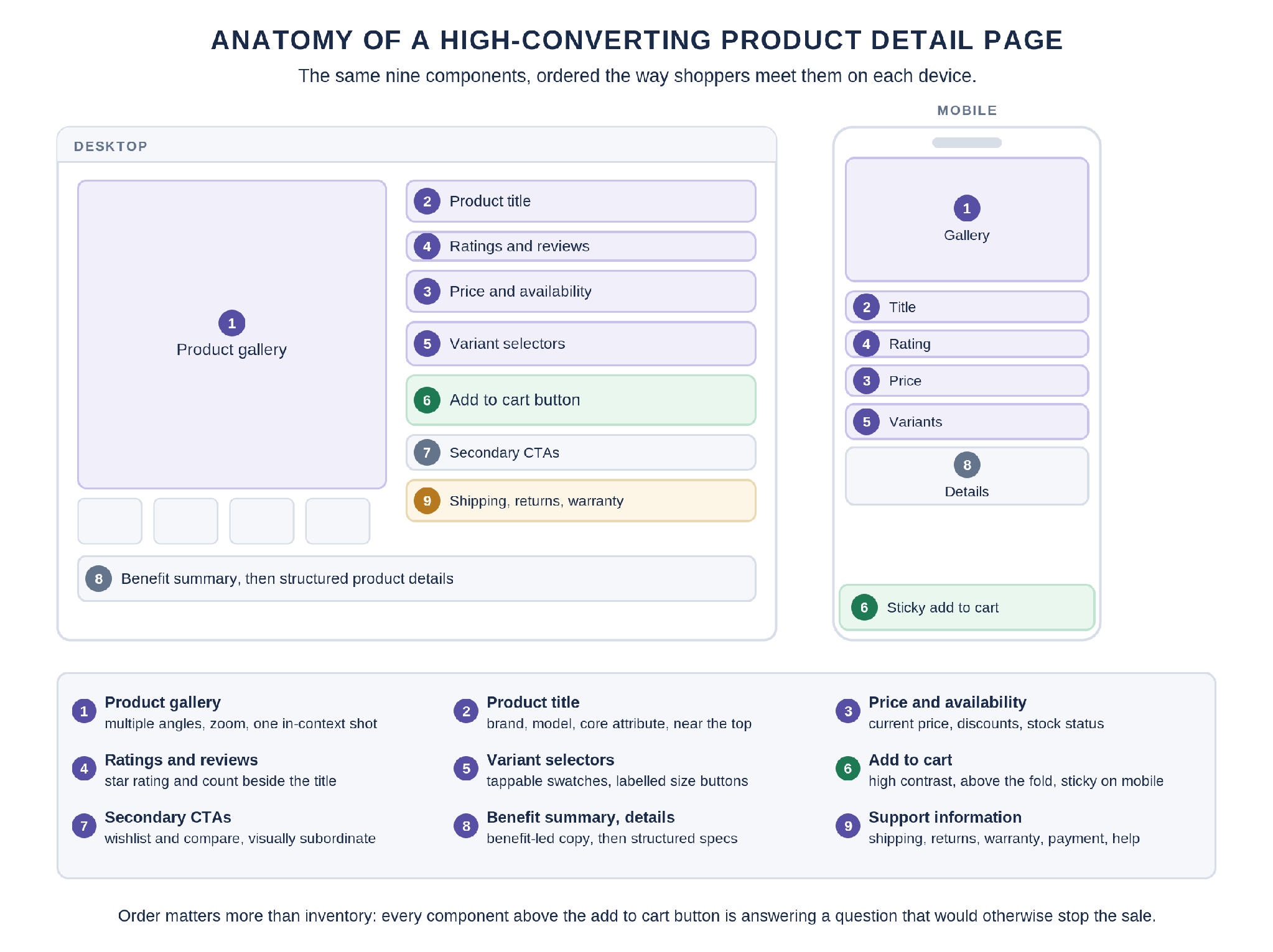
Here are the key components every product detail page should include, presented in the order shoppers encounter them on the page.
Product gallery: A PDP should include high-quality images and videos. Show the product from multiple angles with zoom functionality and at least one lifestyle or in-context shot. 56% of users explore product images first on PDPs, so this is where the heavy lifting starts.
Product title: Clear, specific, and keyword-rich (brand + model + core attribute). Place it near the top of the detail page so it is immediately visible.
Price, promotions, and availability: Pricing transparency is vital on PDPs, including current prices and any discounts. Availability and stock status should be clearly indicated. Yet 67% of sites hide total costs on the product detail page, which directly drives abandonment. Display price and delivery estimates visually close to the buy button.
Ratings and reviews: Star rating and review count near the product title. Customer reviews are crucial for building credibility on PDPs.
Variant selectors: PDPs should offer clear product variation options like size and color. Use tappable swatches and labeled buttons instead of buried dropdowns.
Add to cart button: A prominent add to cart button is essential for conversions. Make it high-contrast, above the fold, and sticky on mobile.
Secondary CTAs: Options like "Buy now," "Add to wishlist," or "Compare" are useful but should not compete visually with the main add to cart button.
Benefit summary + details: Start with concise, benefit-led text, then present structured product details - materials, dimensions, care, technical specs - using bullet points for scannability.
Support information: Shipping options, returns policy, warranty, payment methods, and help/contact options. Shipping details should be visible, not buried three clicks deep.
Product Detail Page Design Principles and Layout Patterns
This section covers layout and visual hierarchy - how components are arranged rather than what they are.
Visual hierarchy matters: hero media and product title come first, then price and variants, then the add to cart button, then supporting details like description and reviews. Effective PDPs organize critical information to prevent overwhelming users with everything at once.
Desktop layout: The classic pattern places the image gallery on the left with key product details and the add to cart column on the right. Full description, reviews, and cross-sells sit below.
Mobile layout: Stack sections vertically - hero image, title, price, rating - with a sticky add to cart bar that stays visible while scrolling. Readable font sizes and large tap targets are essential.
Minimalist vs. content-heavy: Minimalist PDP design works for simple products or brand-led aesthetics. Content-heavy pages suit electronics or furniture. Either way, prioritize clarity over decorative elements.
Two modern PDP layouts worth testing: "sticky photos + scrollable info" (images stay while details scroll) and "sticky info + scrollable gallery" (CTA and price remain fixed). Which works best depends on whether visuals or specifications drive the purchase decision for that particular product.
Aggressive cross-sells or pop-ups near the main CTA can distract and should be pushed lower on the page. Consistent spacing, typography, and button styles across all product detail pages build familiarity and trust for new customers.
Research from Baymard Institute shows that 52% of desktop sites deliver mediocre product page UX, and mobile fares even worse at 62%. There is significant room for improvement.
How to Present Product Details, Media, and Variants
This section focuses on the display of PDP content so online shoppers can quickly understand the product without needing to physically interact with it.
Product descriptions: Start with a short, benefit-focused paragraph highlighting unique selling points. Follow with bullet points covering specs like dimensions (in both cm and inches), weight, materials, compatibility, and care instructions. Avoid walls of text.
Product images: Use consistent backgrounds, true-to-life colors, and close-ups of important features. Include a zoom or hover-to-zoom feature. High-quality images increase buyer confidence and reduce abandonment - most shoppers rely on visuals to evaluate a specific product they cannot touch. Aim for product images shot from different angles so other shoppers can assess the item thoroughly.
Product video: Short demo clips (15–60 seconds) answering "how it works" and "how big it is" significantly help conversion. 82% of consumers buy after watching a product video. Shoppable video is an emerging format worth exploring for ecommerce brands looking to boost engagement with rich media.
Variant selection: Use visual swatches for colors, labeled buttons for sizes, and ensure selecting a variant instantly updates the price, image, and availability for the same product. Avoid confusing variant names - "midnight" means nothing without context. Add helper text like "Model is 178 cm and wears size M" to reduce fit uncertainty.
For complex products, link to technical or downloadable assets (PDF manuals, spec sheets) directly from the product details section. Virtual try on features are also gaining traction for apparel and eyewear.
Trust, Social Proof, and Micro‑copy on Product Pages
Trust elements on a product detail page often decide whether a hesitant visitor completes the purchase or leaves. People's fear of making a bad purchase decision is real, and your page needs to address it head-on.
Reviews: Place the star rating near the product title and price, with review count as a clickable anchor that scrolls to full reviews lower on the page. 79% of consumers trust online reviews as much as personal recommendations, making genuine reviews one of the most powerful conversion levers available. Encourage feedback from other customers and display it prominently.
User-generated content: Customer photos and Q&A sections add authenticity beyond brand photography. They show what the product looks like in real life, helping other shoppers make informed purchases.
Trust signals: Secure checkout badges, accepted payment logos, guarantees, and realistic stock indicators ("Only 3 left - more on the way") all reduce purchase anxiety for your ecommerce site.
Micro-copy near critical elements: Sizing help links near size selectors, "Free returns within 30 days" near the add to cart button, and delivery estimates near the price. These small phrases do a surprising amount of heavy lifting in removing last-second doubts.
Avoid fake urgency or misleading scarcity. If the stock count is artificial, shoppers will notice and trust erodes. For premium or unfamiliar ecommerce brands, add a short brand story or quality assurance snippet to reduce perceived risk for new customers.
Mobile‑First, Performance, and Accessibility for PDP Design
Over 70% of ecommerce traffic now comes from mobile devices, making mobile PDP design a priority for every ecommerce business. Yet mobile conversion rates consistently trail desktop by a wide margin.
Mobile-first practices: Vertical stacking, large tap targets for variant selectors, and a sticky bottom bar with price and add to cart button. Mobile-first design considerations include touch-friendly interfaces and legible text - readable font sizes are not optional.
Performance: Fast loading times are crucial for maintaining user engagement on PDPs. Optimize image sizes, lazy-load lower sections, and strip out heavy scripts that slow down the product detail page. Target an LCP under 2.5 seconds. Optimization for various devices is essential for user experience on PDPs, whether users browse on a phone, tablet, or desktop.
Accessibility basics: Sufficient color contrast for text and buttons, descriptive alt text for all product images, and keyboard-focusable interactive elements. Properly marked-up headings and lists on the detail page help screen-reader users understand product details easily. Accessible PDPs generally perform better in search engines and reduce legal and reputational risk.
Optimizing Product Detail Pages for SEO and Conversion
SEO and CRO are not competing priorities on a product page - they reinforce each other. The same clarity that helps users convert also helps search engines understand your page.
Titles and meta descriptions: Unique titles and meta descriptions improve search visibility. Include the product name, category, and relevant keywords.
URLs: Use readable, keyword-informed URLs (e.g., /products/organic-cotton-hoodie-black).
Structured data: Implement Product schema to surface rich results - price, availability, review stars - directly in Google search.
Original content: Write custom descriptions and product-specific FAQs instead of copying manufacturer stock text. Add unique images. This prevents duplicate content issues and improves ranking.
A/B testing: Test add to cart button color and size, repositioning of shipping info, or alternative product images. Even small changes to a good product detail page can lift conversion meaningfully.
Metrics: Measure success with add-to-cart rate (average ~6%, top stores above 9.6% per EcomHint), conversion rate, and revenue per visitor - not just time-on-page.
Examples and Practical Tips for Different Product Types
A good product detail page adapts its design to answer each category's most common pre-purchase questions.
Apparel and footwear: Focus on size guides, fit notes ("runs small"), on-model photos with body measurements, and flexible returns messaging. Customer reviews mentioning sizing are especially helpful for shoppers who cannot physically interact with the fabric.
Electronics and tech: Spec comparison tables, compatibility details (OS, accessories), warranty info, and close-up images of ports or controls. Example: linking to a downloadable PDF manual directly from the product details.
Home and furniture: Scale images with room-context photos, material close-ups, and clear delivery/assembly notes. Dimensions are important details that prevent costly returns.
Beauty and consumables: Ingredient lists, usage instructions, safety warnings, and before/after imagery help shoppers evaluate a specific product before committing.
Each category has its own shopping journey, and your PDP content should reflect that.
Building and Maintaining Product Detail Pages at Catalog Scale
Everything above describes one good product detail page. Doing it across a catalog of thousands of SKUs is a different problem, and it is where most ecommerce teams stall. The advice does not change with catalog size, but the work does: unique copy, complete specs, and accurate variant data on every product page is not something a small team can write by hand, and it is not something that stays correct once written.
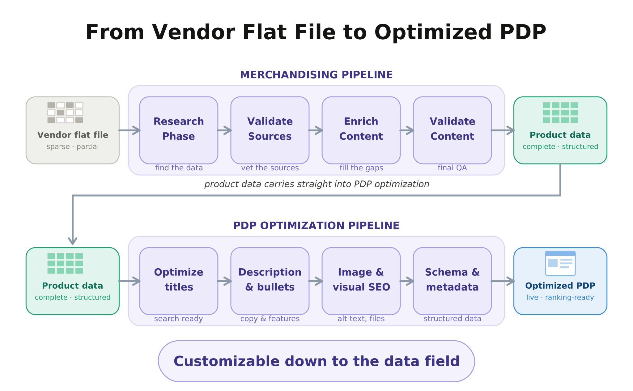
Two pipelines handle the two halves of that problem. One builds the page content from verified product data. The other keeps it current after it publishes.
The Merchandising Pipeline: Building the Page Content
The merchandising pipeline turns whatever product data you already hold into complete page content for every SKU. The order of the stages is the important part, because research happens before anything is written.
Research the live source: Universal Search locates the manufacturer or vendor page for each product, and Smart Scrape pulls the structured content off it. PDF line sheets and supplier feeds are parsed into the same shape. The output is a verified product record rather than an assumption about the category.
Enrich the attributes: Fill the fields the category actually requires - material, dimensions, compatibility, capacity, certifications. This is the highest-leverage step for a product detail page, because the same attribute data drives the spec table, the variant selectors, the filters, and the Product schema at the same time.
Apply rules and examples: Per category, you define the title pattern and its character budget, the attribute schema, the tone, and the terms that are never allowed. This is written once per category and applied to every SKU in it, which is what keeps thousands of product pages consistent without making them identical.
Generate the page content: Title, description, specs, meta description, and image alt text, written from the verified record rather than from what is typical for the category. Two products with different specifications produce different pages.
Validate, then publish: Required attributes present, character limits respected, no duplicate phrasing against the rest of the catalog, Product schema valid. A record that fails goes back to generation rather than forward to the site.
This is also what separates grounded generation from templating. A template arranges the fields you already have, so a missing material stays missing and every page in the category comes out structurally identical. Researching the product first means the description is written from what the manufacturer actually published, and anything the pipeline could not verify is flagged rather than filled in with something plausible.
The PDP Optimization Pipeline: Keeping Pages Current
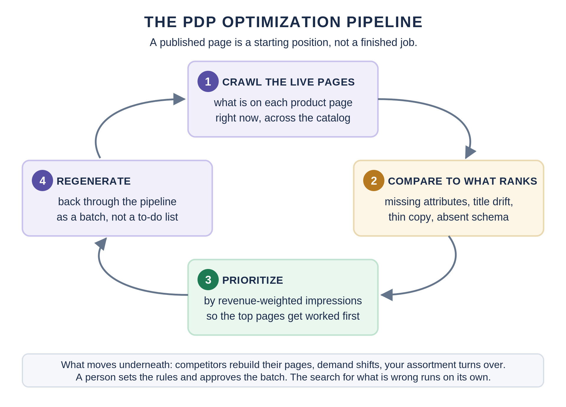
Publishing a good product detail page is a starting position, not a finished job. Competitors rebuild their pages, the terms shoppers use shift with the season, search results reshuffle, and your own assortment turns over. The standard advice for this is to monitor Search Console and iterate, which is reasonable for a few hundred pages and impossible for tens of thousands.
The optimization pipeline runs the analysis a good merchandiser would run on one page, against every page, on a schedule.
Crawl the live pages: Take what is actually on each product detail page right now, across the whole catalog, rather than what the PIM says should be there.
Compare against what ranks: For each product, check the live page against the pages currently ranking for that product's terms. The common findings are attributes the top results populate and yours leaves blank, titles whose leading terms have drifted away from current demand, thin or duplicated description copy, and missing or invalid Product schema.
Prioritize by revenue-weighted impressions: Sorting by traffic sends you to pages that already work. The useful sort is pages being shown for valuable queries and not converting those impressions into clicks, because those have already proved the demand exists and are losing on execution.
Regenerate as a batch: Findings go back through the merchandising pipeline as a regeneration job rather than a to-do list. The attributes that were missing get retrieved and filled, drifted titles get rewritten, weak meta descriptions get rebuilt, and the batch is validated before it ships.
A person still sets the rules, reviews the batch, and approves what goes live. What changes is that nobody has to decide which of forty thousand product pages to open next.
How Many of Your Product Pages Would Pass the Checklist Above?
Send us a crawl of your live product detail pages or an export of the product data behind them. We will tell you where the attributes are missing, which descriptions are duplicated from the manufacturer feed, and what a complete version of those pages would look like on your own SKUs.
Product page audit
How many of your product pages would pass the checklist above?
Send us a crawl of your live product detail pages, or an export of the product data behind them. We will tell you what it actually contains.
Where attributes are missing against the schema each category actually needs
Which descriptions are duplicated from the manufacturer feed and published by every other retailer
What a complete, grounded version of those pages would look like on your own SKUs
How many images should a product detail page include?
Most PDPs should aim for 4–8 high-quality images per product, covering front, back, close-up details, and at least one lifestyle or in-context shot. Complex or high-priced products like furniture or electronics often benefit from 10+ images, as long as load speed remains fast and navigation stays intuitive.
How often should I update content on my product pages?
Core specs rarely change, but pricing, promotions, and shipping information should stay in sync with inventory and logistics in real time. Review your top-selling product detail pages quarterly to refresh copy, add new reviews or customer photos, and update FAQs based on customer support feedback.
Should every PDP have its own FAQ section?
Individual product FAQs are valuable for complex or frequently questioned items. Simpler products can rely on a global FAQ linked from the page. Add product-specific FAQs when customer support repeatedly fields questions about sizing, compatibility, or setup for a particular product.
What is the ideal placement for the add to cart button?
The primary add to cart button should appear above the fold next to the price and variant selectors on both desktop and mobile. On mobile, a sticky add to cart bar that remains visible as shoppers scroll through product details and reviews is the most effective pattern for driving purchase decisions.
How many related products should I show on a product details page?
Showing 4–8 related or complementary items is usually enough to offer choice without overwhelming users. Place related products toward the lower part of the PDP - after core product details and reviews - so they support the store's cross-sell strategy rather than distract from the primary purchase.






.png)